Anatomy of a Perfect Landing Page
Seven sections that actually do work — and why most landing page templates ship with three too many.
What this infographic is actually arguing.
"Perfect landing page" is an oversold phrase — there is no universal template — but there is a consistent set of sections that do work and an equally consistent set of sections that show up on every template and add nothing. This infographic covers the seven sections that reliably earn their place and the three that most templates include because they're expected rather than useful.
Section one: the hero. The buyer decides in three seconds whether to keep reading. The hero has to do two things in that window — name the specific problem or audience, and name the specific thing this page offers. Generic hero copy that could describe any product in the category loses the reader immediately. The best B2B heroes are specific enough to exclude the wrong buyer on purpose.
Section two: the problem frame. State the problem as the buyer experiences it, not as you solve it. Buyers want to feel understood before they evaluate a solution. Skipping this section is the most common mistake on founder-written pages — they jump to the solution before earning the right to propose one.
Section three: the solution, stated clearly. Not every feature. Not the roadmap. The one to three moves this product makes that the problem frame demands.
Section four: evidence. Named customers, specific outcomes, third-party validation. The rule of specificity applies: a named CFO with a specific percentage moves the reader; "loved by marketers everywhere" doesn't.
Section five: the objection section. Every serious buyer has three objections — price, integration risk, and switching cost are the usual suspects. A landing page that pretends those objections don't exist loses the buyer who has them. Name them and answer them on the page.
Section six: the single call-to-action, made obvious.
Section seven: the trust layer. Security, compliance, support availability, company information. Boring but load-bearing.
The three sections most templates include that fail: the "about us" paragraph, the team photos, and the generic "our values" block. Buyers don't care about your values on a landing page — they care about whether you can solve their problem. Save that material for the about page, where readers go when they're already interested.
Stratridge's Positioning Audit pressure-tests the hero section directly.
Conversion & Engagement
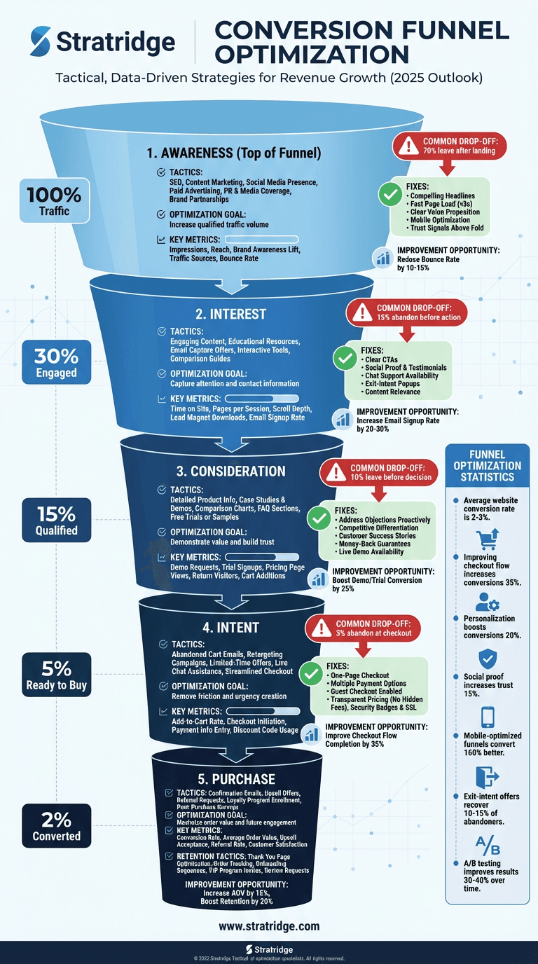
Conversion Funnel Optimization
Where funnels actually break — and the order of operations for fixing them without rebuilding the whole thing.
Effective Call-to-Action Design
The two-word test that predicts CTA performance better than any color or placement study.
The Power of Personalization
Personalization that converts versus personalization that creeps — and the data minimum each one requires.
This infographic is free. The audit is too.
Paste your URL and Stratridge returns an audit graded against the six dimensions and twenty-four factors — so you see where the story on your site lines up with the story this infographic describes, and where it doesn't.