User Experience in Marketing
Where UX and marketing overlap — and the handoff problem that kills conversion in the seam.
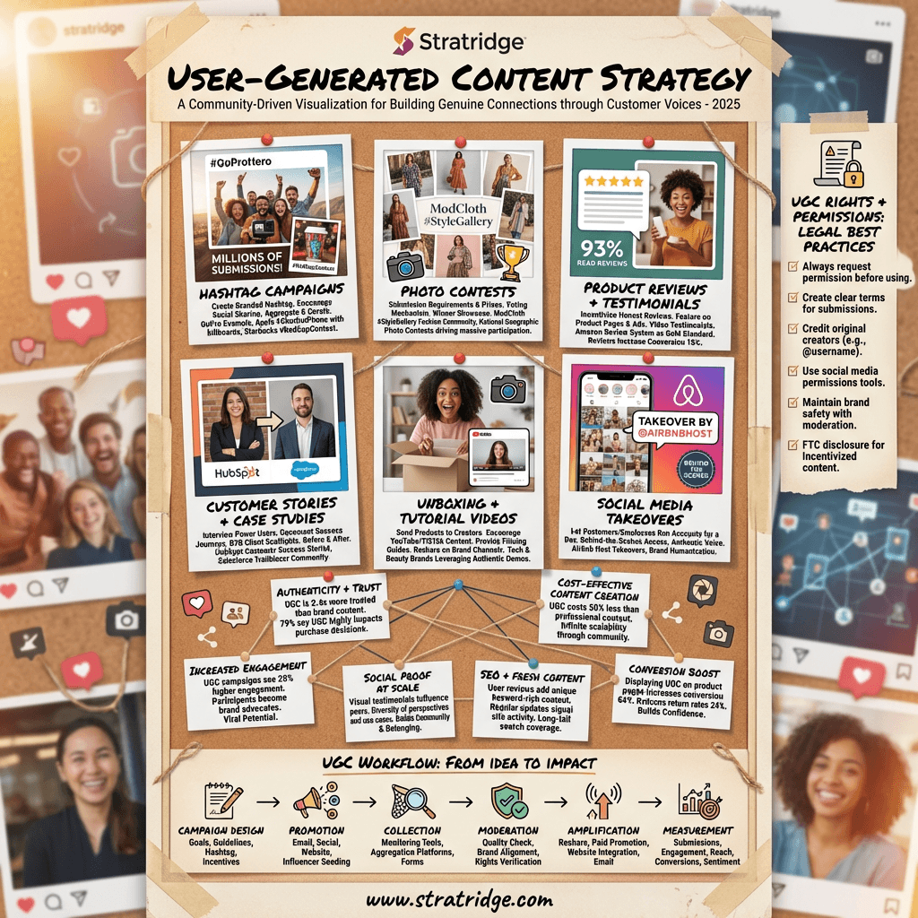
What this infographic is actually arguing.
User experience and marketing sit on opposite sides of an organizational seam in most B2B companies. Marketing owns the traffic; product owns the signed-in experience; UX reports to product. The middle — the marketing site, the sign-up flow, the first session — gets neglected because it's nobody's primary responsibility. This infographic covers the places UX and marketing overlap and the handoff problems that quietly destroy conversion in the seam.
The clearest overlap is the conversion flow from landing page to activated account. A beautiful marketing site that hands off to a sign-up flow designed by the product team — usually for the existing customer, not the first-time visitor — loses conversion in predictable places. Too many fields in the sign-up form. A product tour that starts before the user knows why they're there. An email verification step that interrupts momentum for no user-visible reason. These aren't UX problems in isolation or marketing problems in isolation; they're seam problems.
The second overlap is the signed-out experience of the product. Public documentation, the changelog, the status page, the public integrations catalog — all of these are simultaneously marketing assets and UX surfaces. Prospects evaluate your product through them. When the docs are excellent, they're a top-of-funnel asset most marketing teams under-credit. When they're thin, they're an invisible drag on consideration-stage conversion.
The third overlap is the navigation architecture. Marketing wants visitors to find high-conversion pages (demo, pricing, case studies). UX wants visitors to find the answer to their question. When these diverge, the nav either buries the answer (frustrating users) or hides the conversion (frustrating marketing). The working resolution is to design nav around the buyer's questions first, let the conversion-surfacing happen through contextual CTAs.
The handoff problem that costs the most: a prospect reads a marketing case study, clicks "Try it free," and gets dropped into a sign-up flow that doesn't reference the use case the case study described. They arrive primed for a specific experience and get a generic one. The fix is either pre-fill / deep-linking so the product flow responds to the entry point, or a transitional page that bridges the marketing context to the product context.
Stratridge's Conversion Audit catches the seam breaks specifically.
Conversion & Engagement
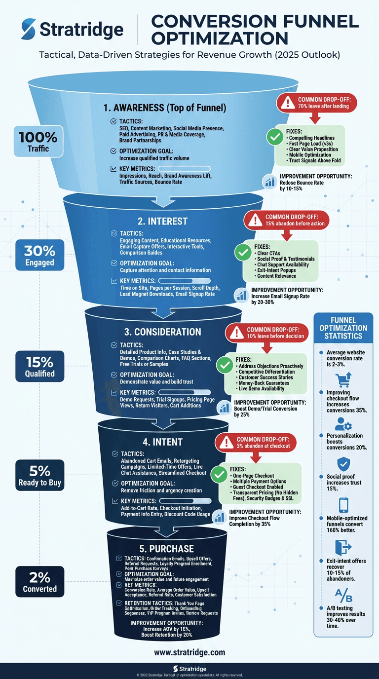
Conversion Funnel Optimization
Where funnels actually break — and the order of operations for fixing them without rebuilding the whole thing.
Effective Call-to-Action Design
The two-word test that predicts CTA performance better than any color or placement study.
Anatomy of a Perfect Landing Page
Seven sections that actually do work — and why most landing page templates ship with three too many.
This infographic is free. The audit is too.
Paste your URL and Stratridge returns an audit graded against the six dimensions and twenty-four factors — so you see where the story on your site lines up with the story this infographic describes, and where it doesn't.