Data-Driven Marketing
The difference between data-informed and data-driven — and why the wrong one wrecks creative judgment.
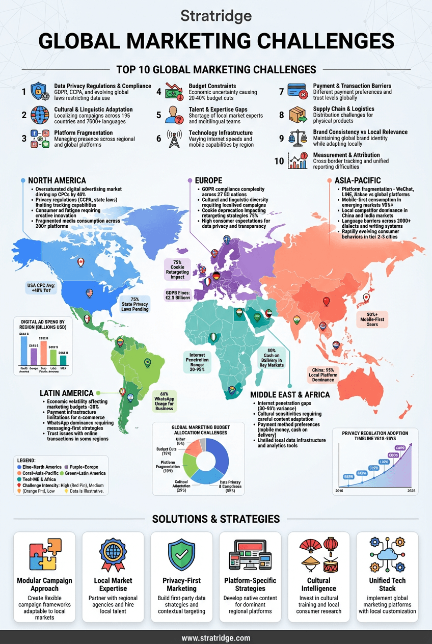
What this infographic is actually arguing.
"Data-driven" has become marketing's virtue signal. Every brief claims it, every platform sells it, and very few teams actually practice it — or, more precisely, very few teams practice it in a way that improves decisions rather than rationalizes them. This infographic separates data-informed marketing (which works) from data-driven marketing (which, taken literally, fails).
The distinction matters. Data-informed means the team uses data to pressure-test intuition, surface patterns that humans miss, and kill programs that aren't working. The human judgment is still the decision-maker; the data is a seat at the table. Data-driven, taken literally, means data makes the call — and in marketing, where most useful signals are noisy, delayed, or imperfectly attributed, that's a recipe for bad decisions delivered with statistical confidence.
The failures of strict data-driven decision-making are well-documented. Optimizing for the metric you can measure drifts the program toward short-horizon, easily-attributed conversion and away from brand, category creation, or anything with a 12-month payback. A/B testing at low-traffic sites produces statistically significant results on underlying noise. Multi-touch attribution flatters whichever channel is closest to the conversion and under-credits whichever one is farthest away, which means "data-driven" budget allocation usually under-invests in top-of-funnel brand work and over-invests in bottom-of-funnel capture.
A working data-informed practice looks like: instrument the fundamentals (conversion rate, CAC, LTV by cohort, pipeline by source), review them on a consistent cadence, use them to kill what's clearly not working, and make the 20% of decisions that have real quantitative signal with data in the lead. Use human judgment — grounded in strategy, customer interviews, and competitive context — for the other 80%.
What most "data-driven" stacks actually produce: a dashboard nobody reads past the top three tiles, a quarterly business review that tells a story the data supports rather than the story the data tells, and a set of decisions made on intuition and post-rationalized with cherry-picked metrics.
The test: if your data told you something uncomfortable this quarter — a top-performer on paper that's actually unprofitable, a champion channel that's not earning its share — did the organization change course? If not, the practice isn't data-driven. It's data-decorated.
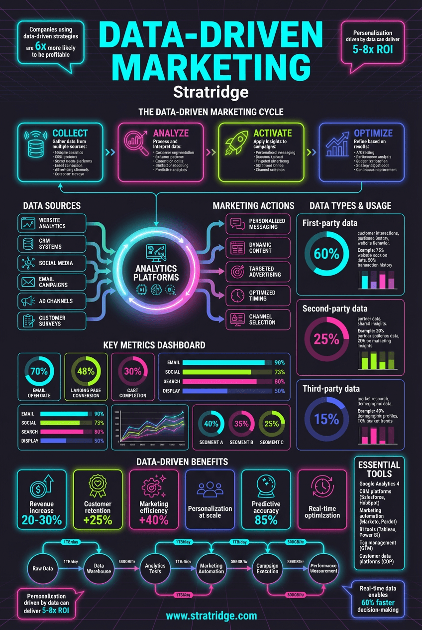
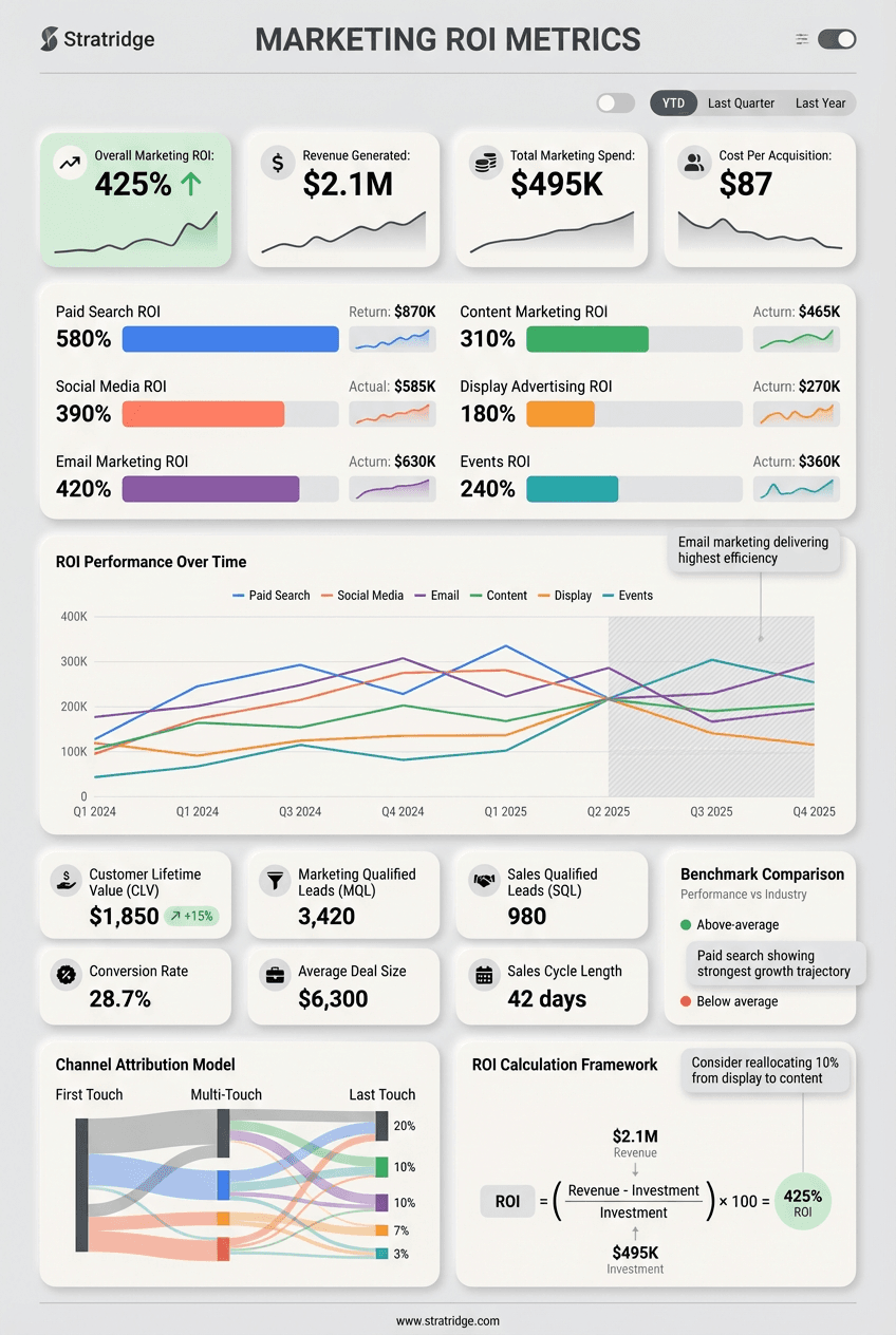
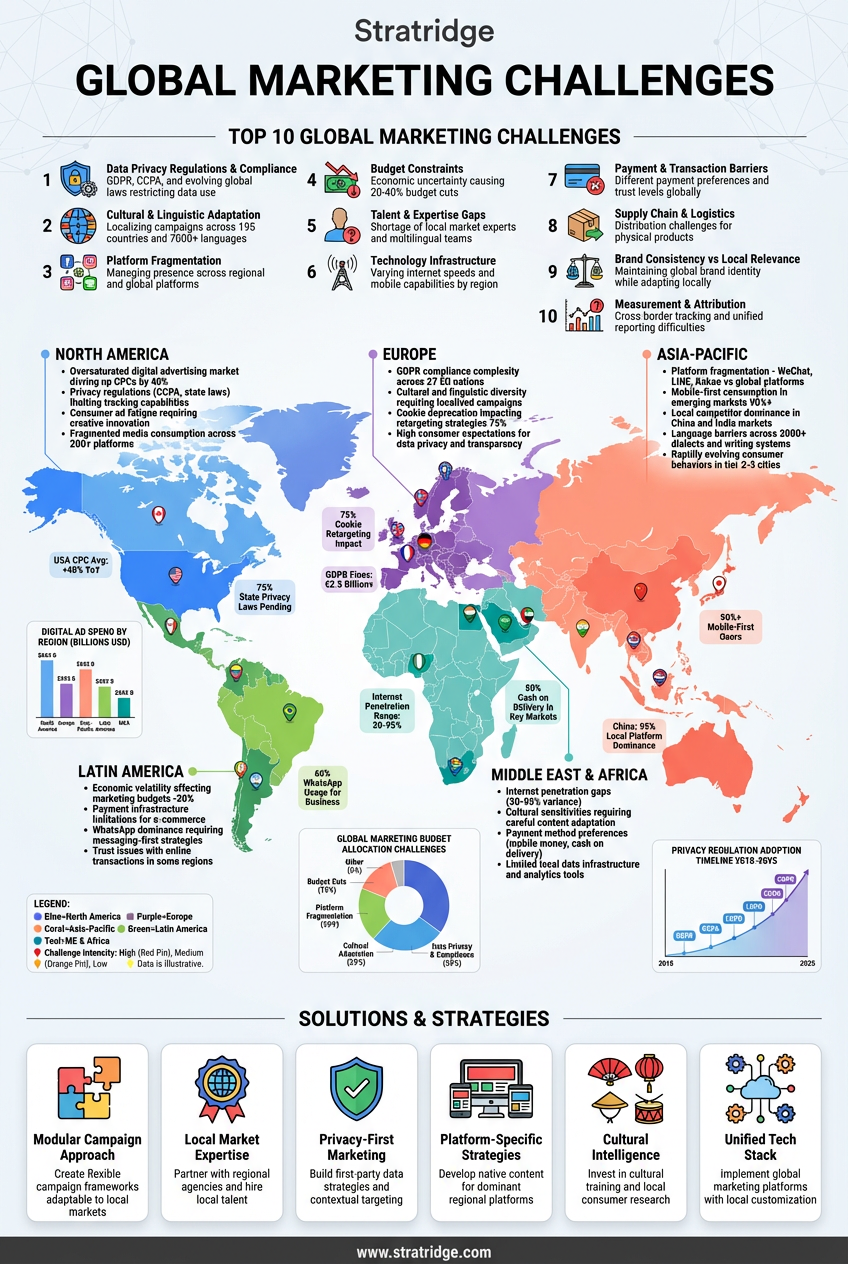
This infographic is free. The audit is too.
Paste your URL and Stratridge returns an audit graded against the six dimensions and twenty-four factors — so you see where the story on your site lines up with the story this infographic describes, and where it doesn't.